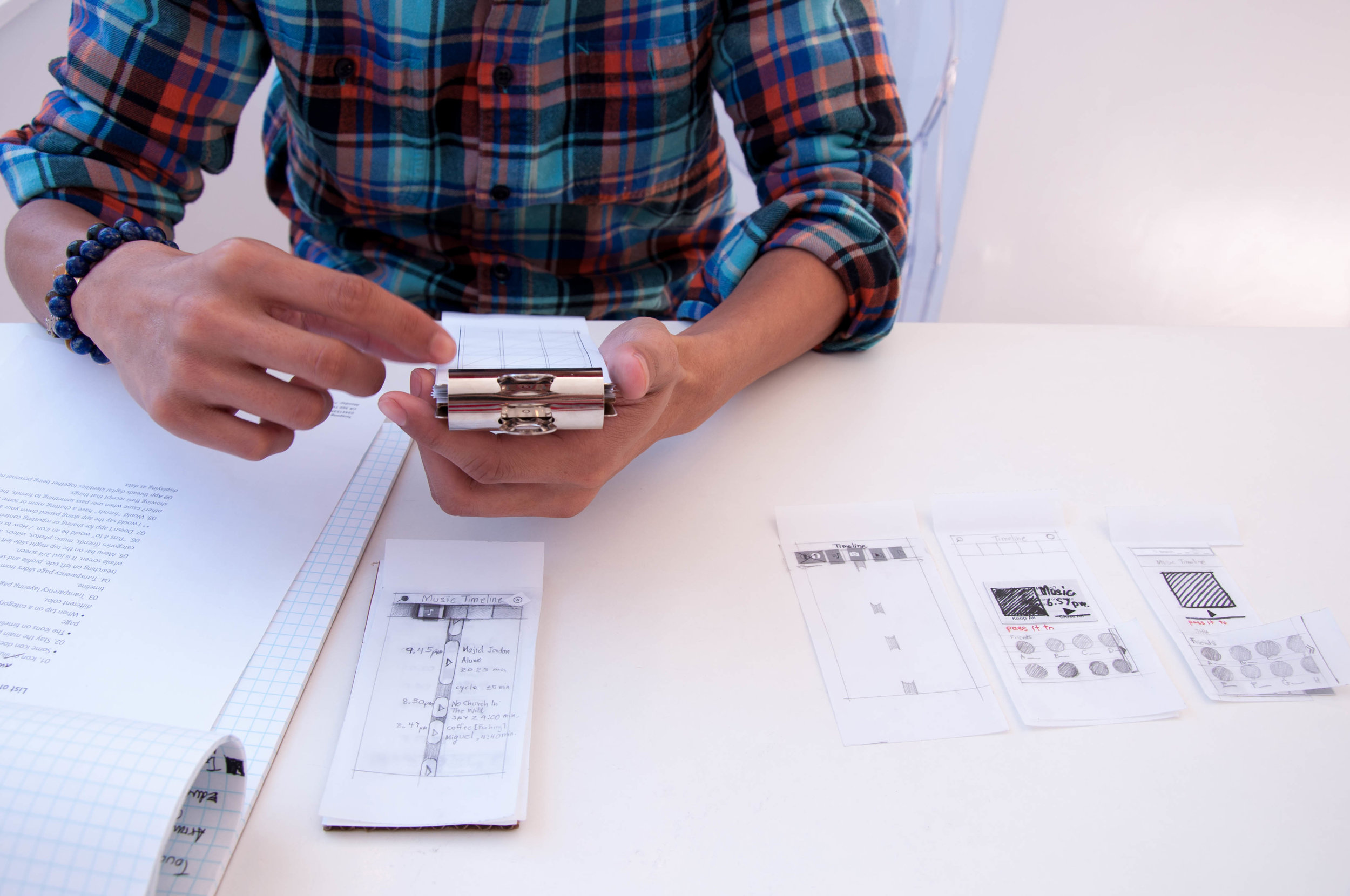
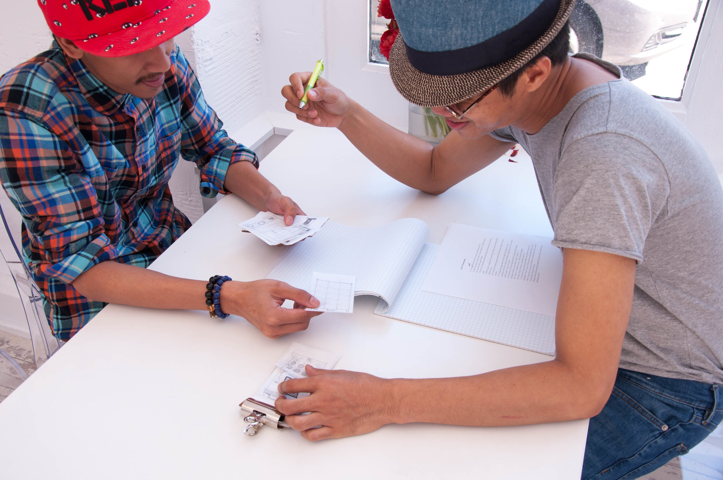
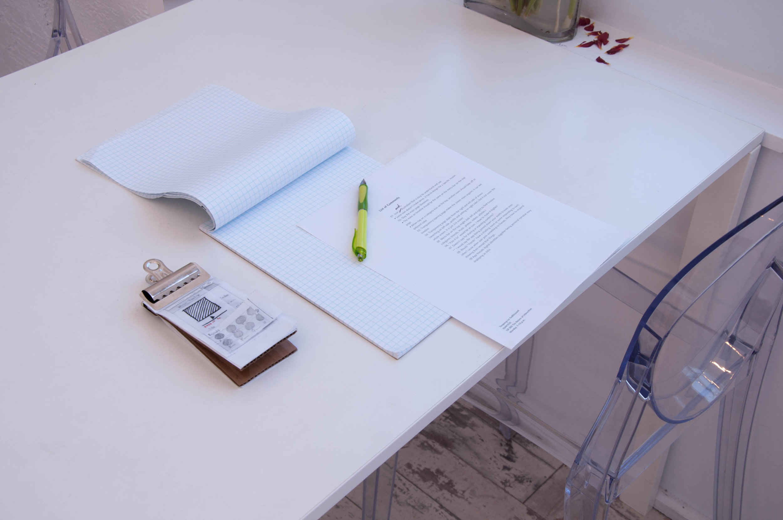
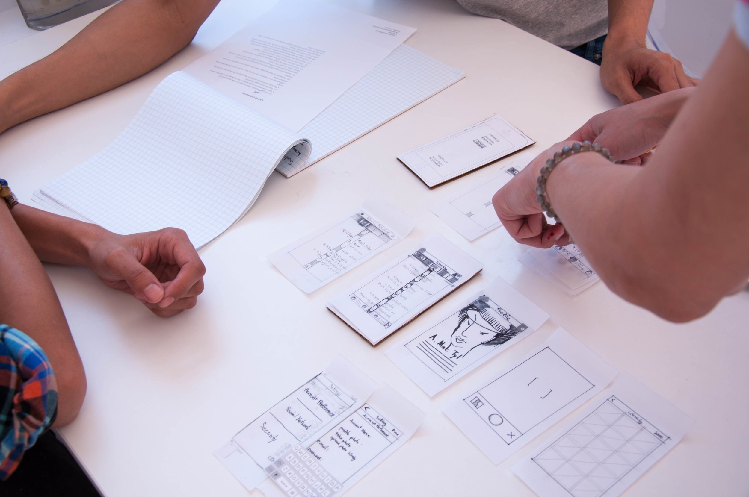
Span
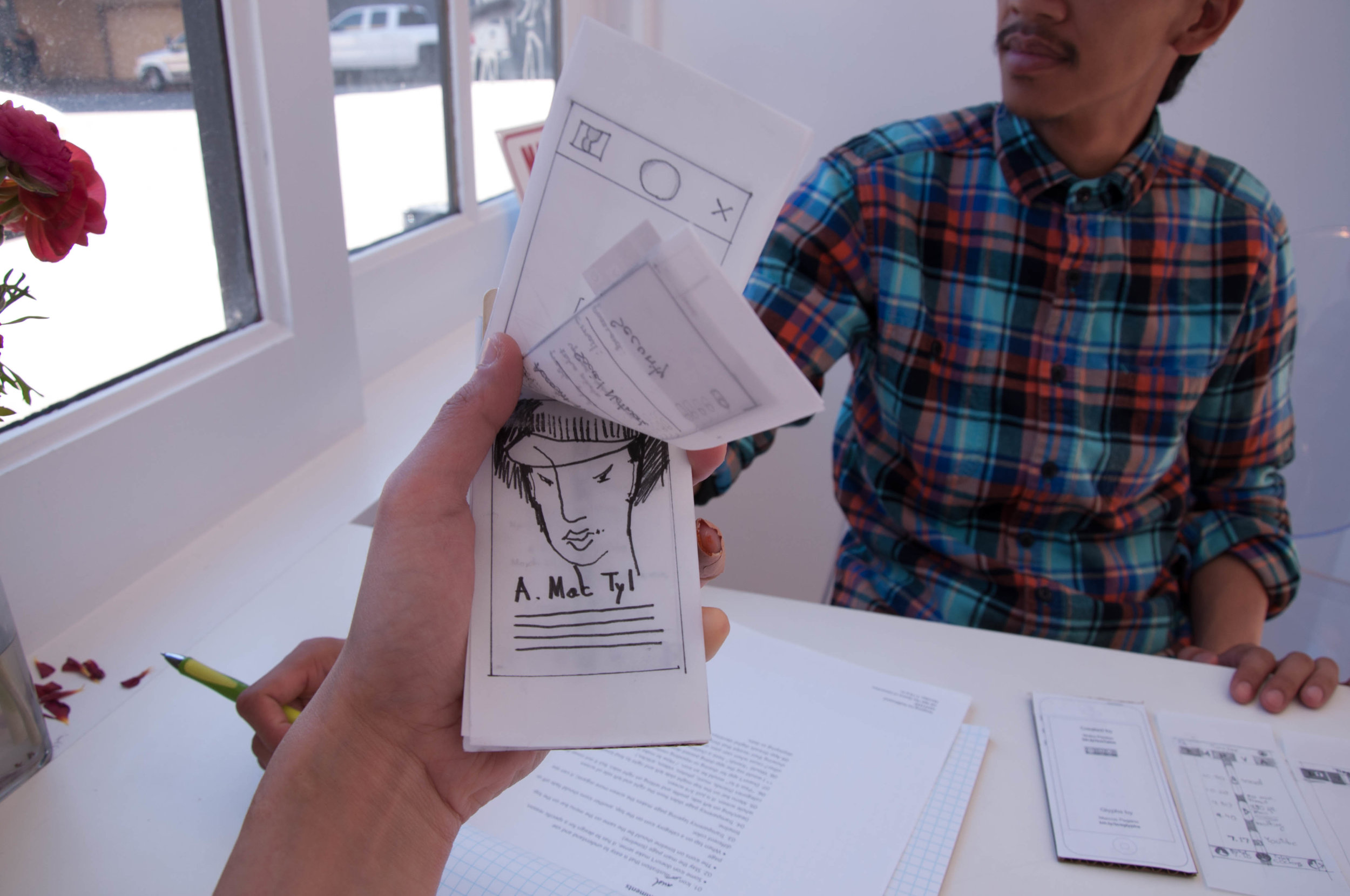
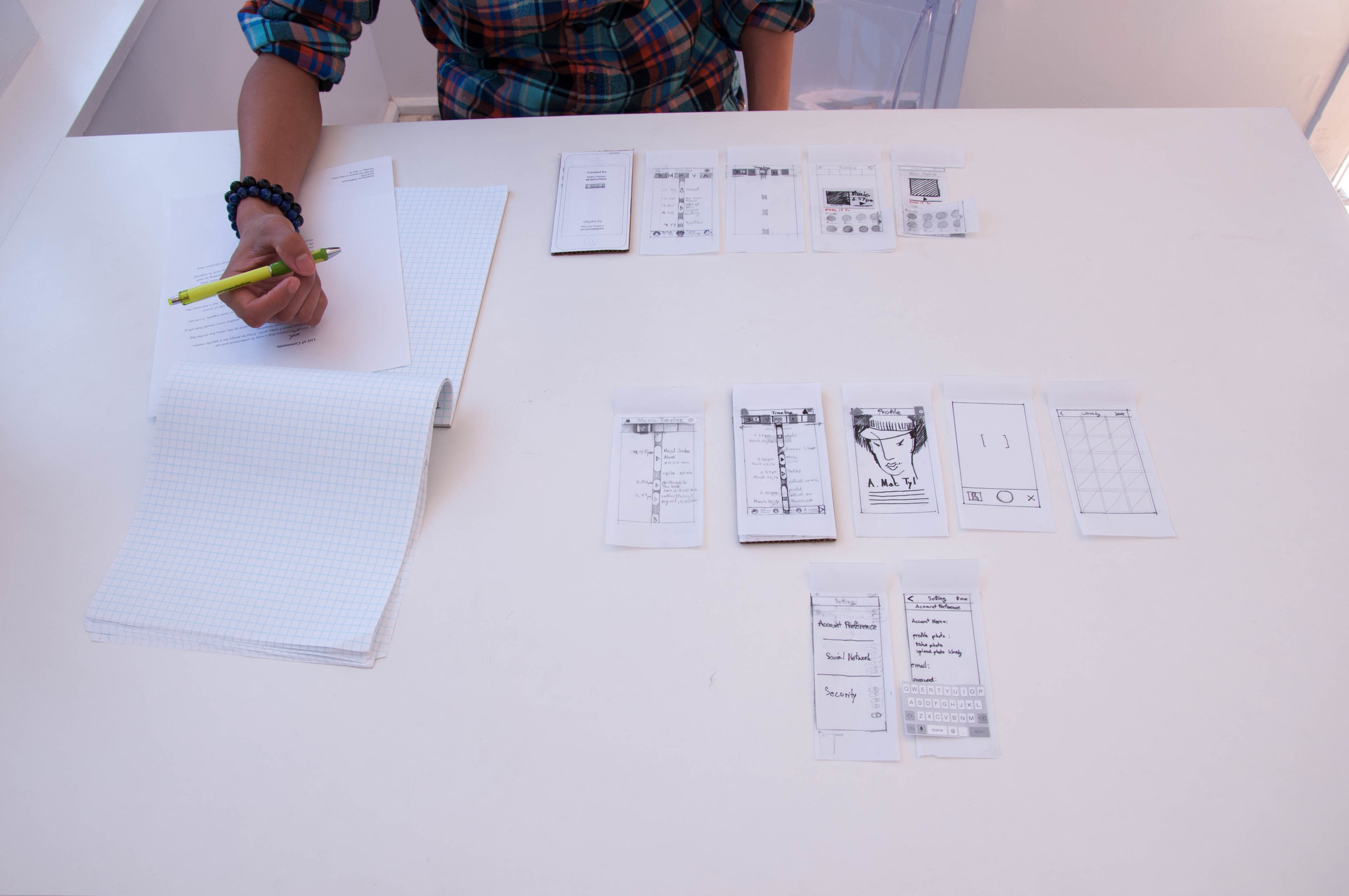
User testing
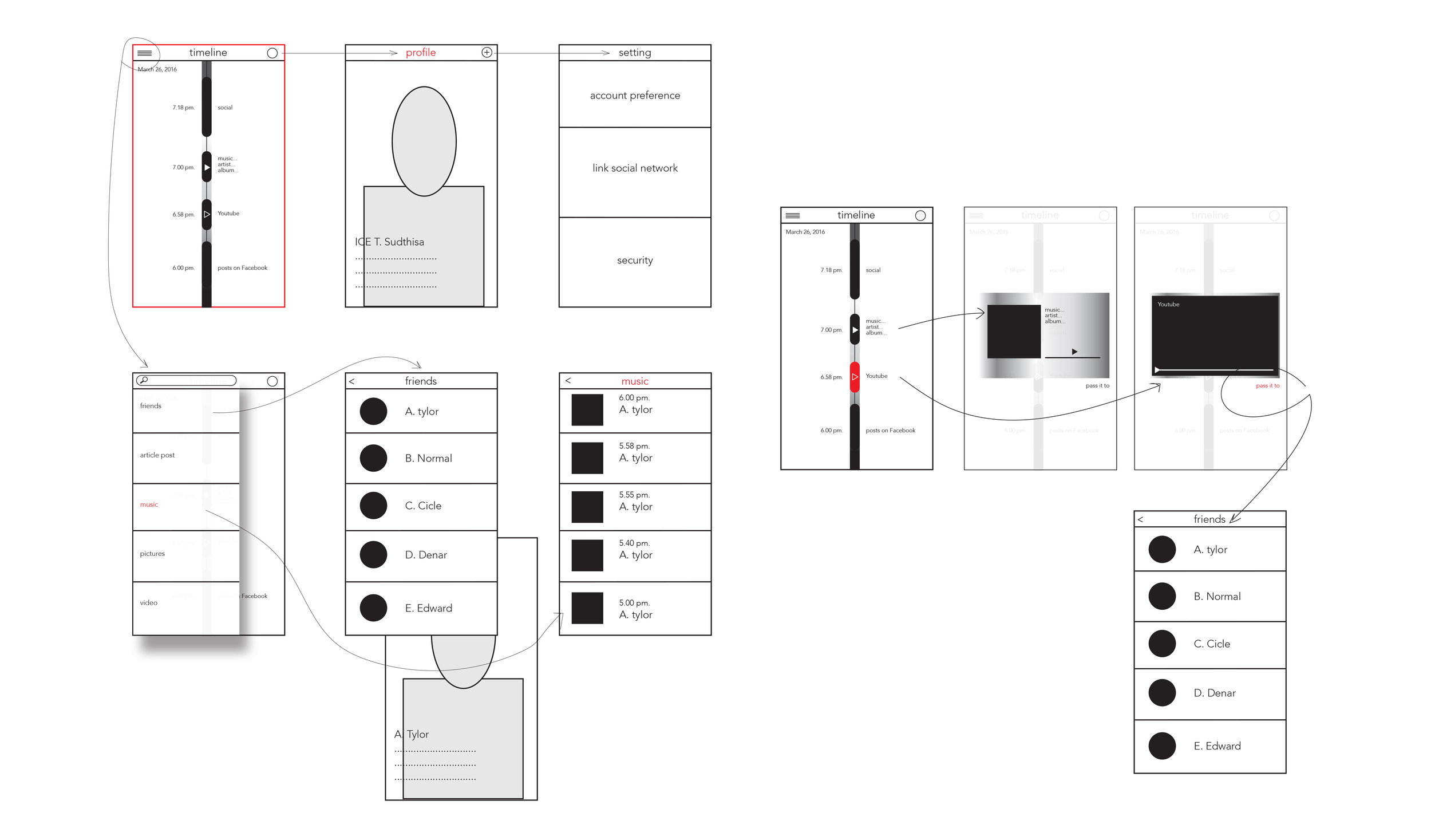
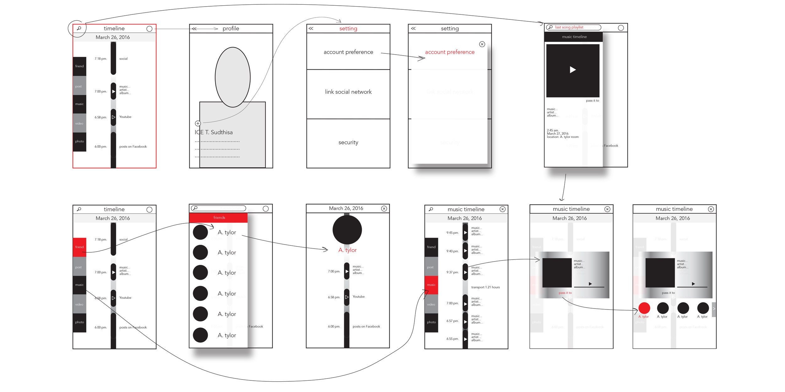
App Structures
Moodboard
Project Description
In this class, research and design strategies align a brand with a series of design communication solutions. Students develop mobile design and an interface that engage an audience.
Project Concept
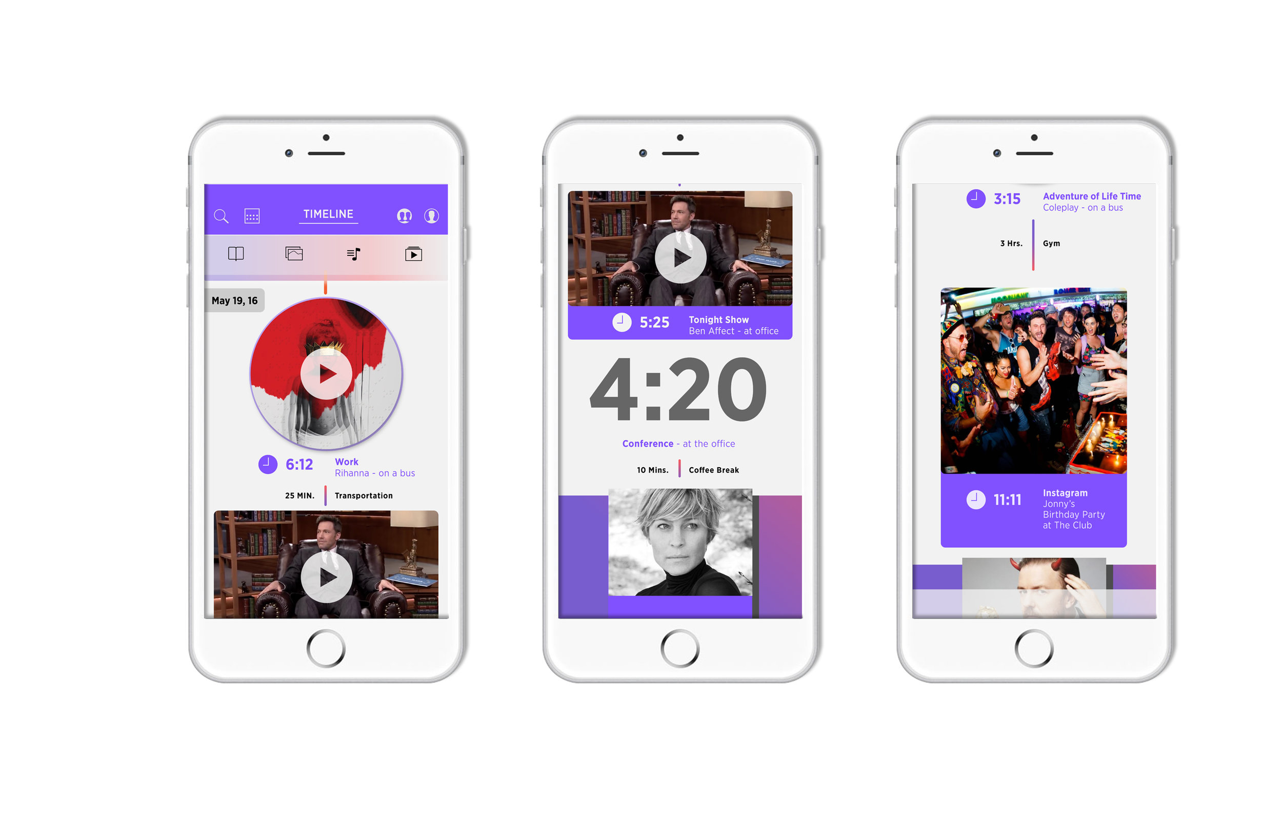
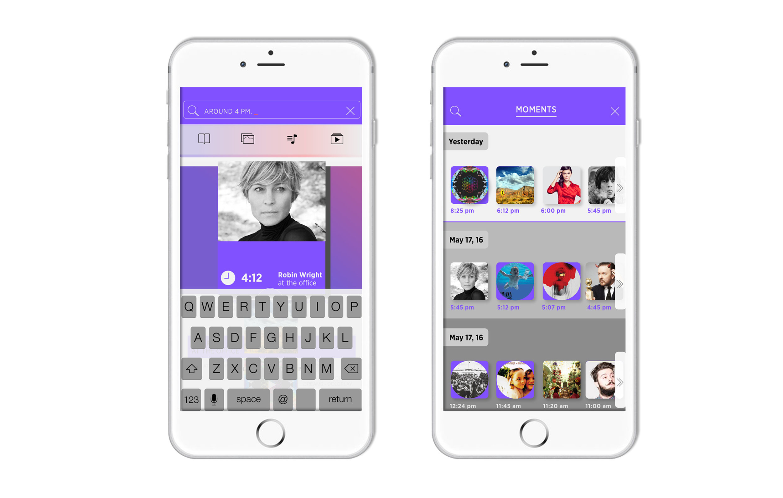
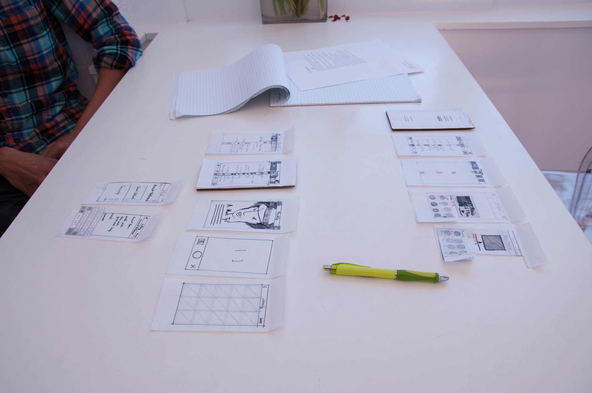
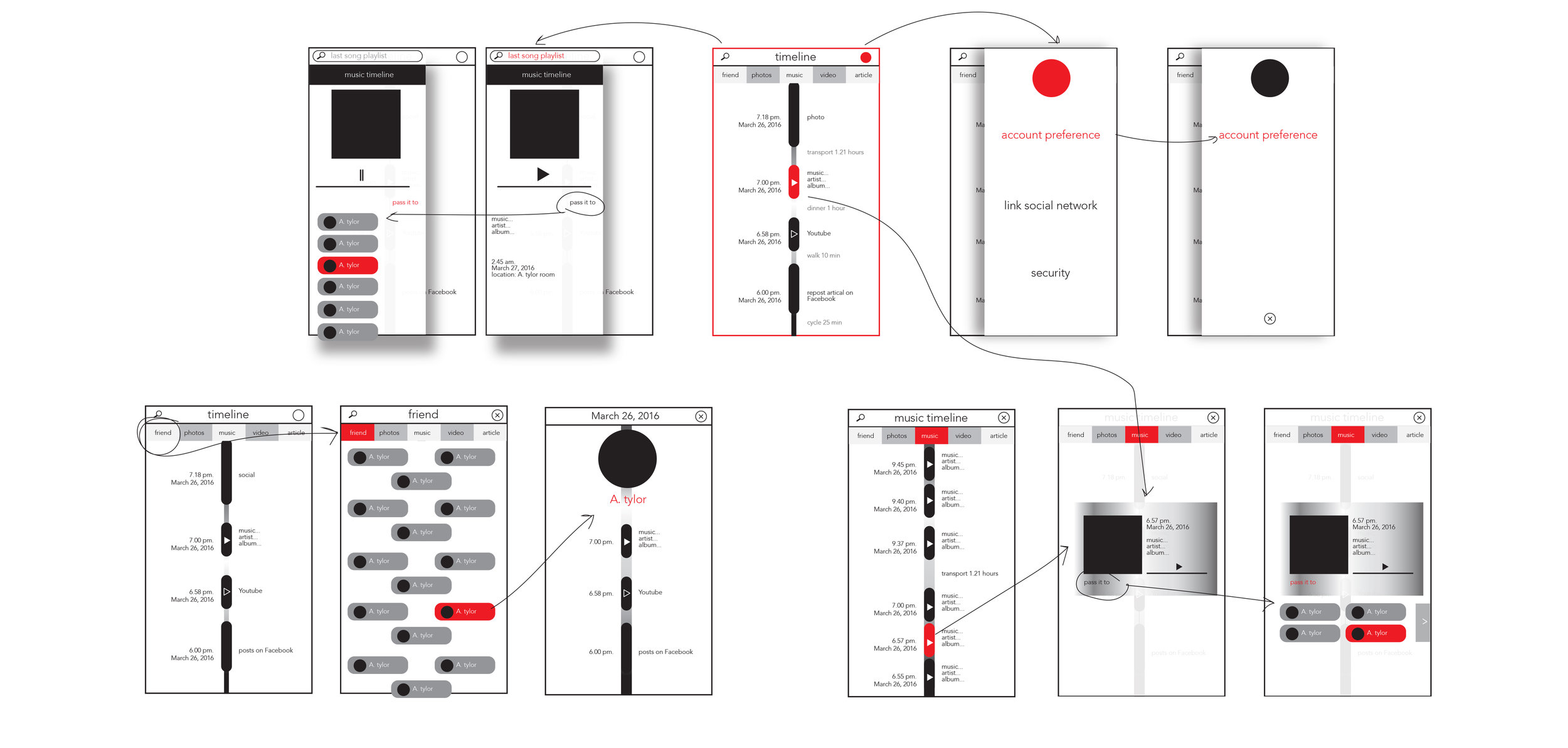
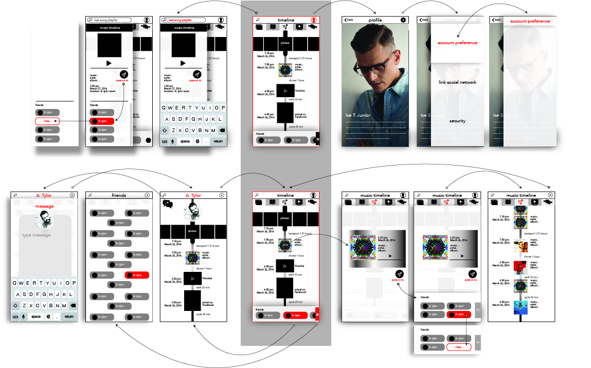
I created a digital timeline that threaded social media, digital subscriptions, music, and calendar to be a personal digital archive. I researched and interviewed my target audience who are people between 23-33 years old. Then, I came up with an application called "Span."
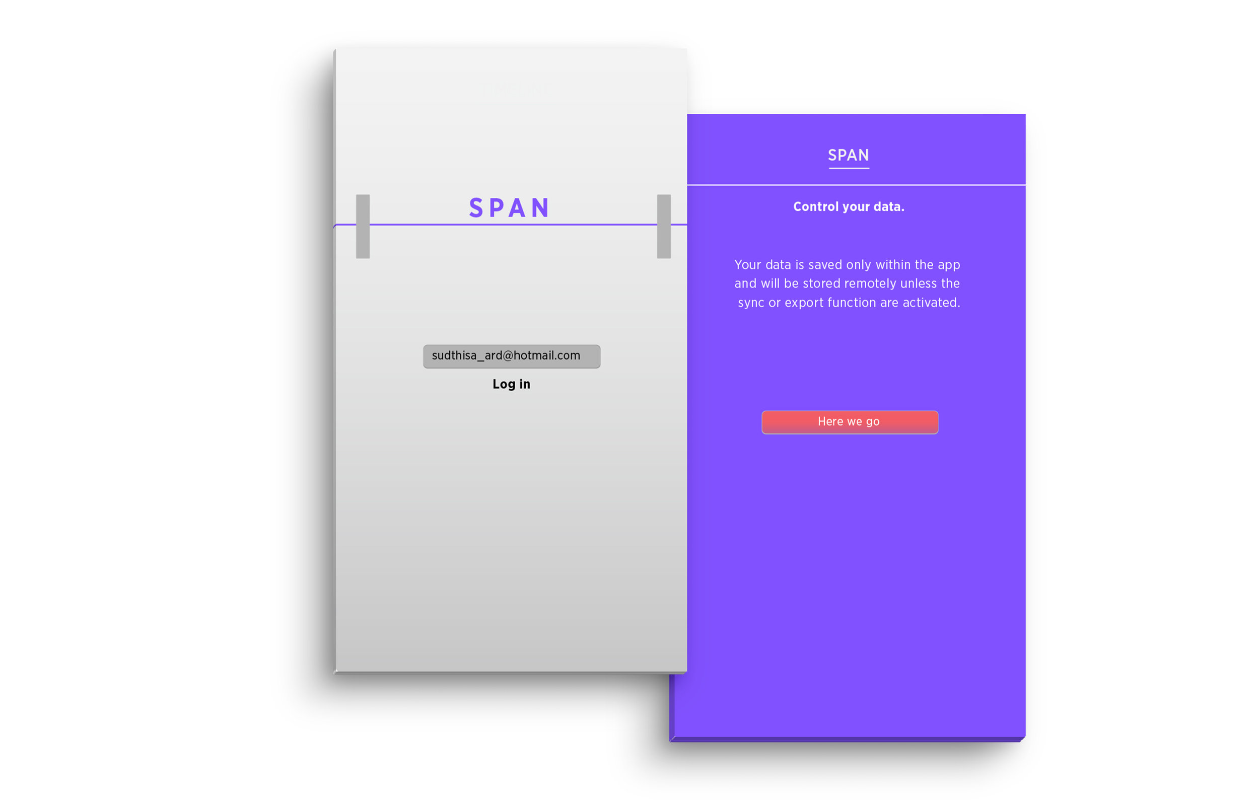
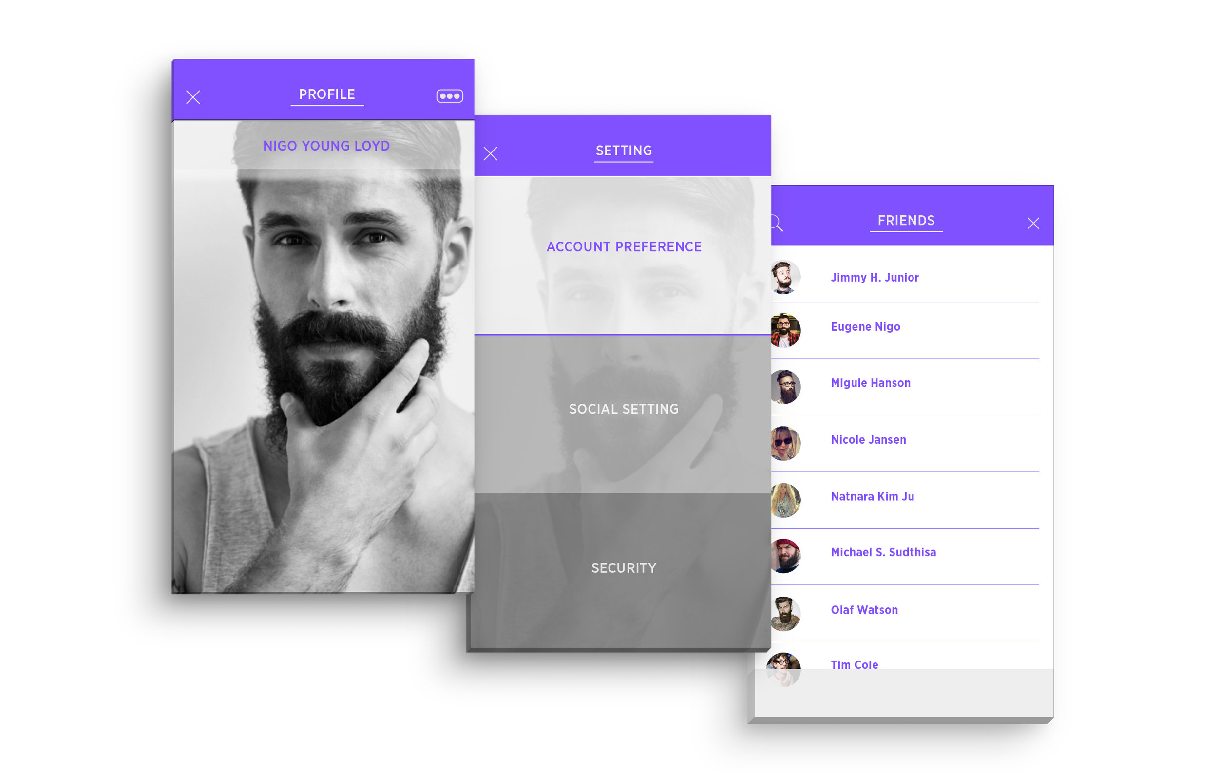
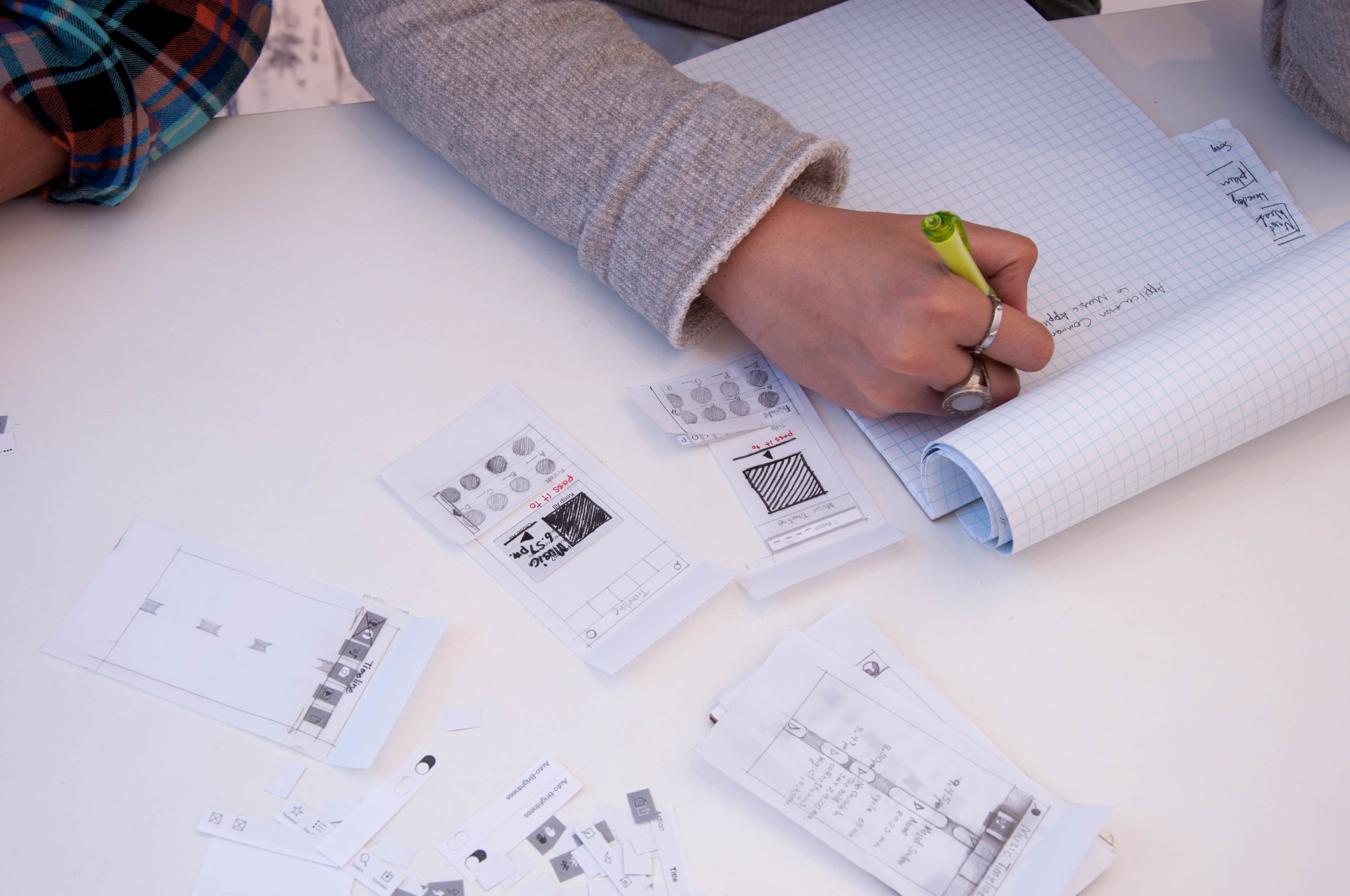
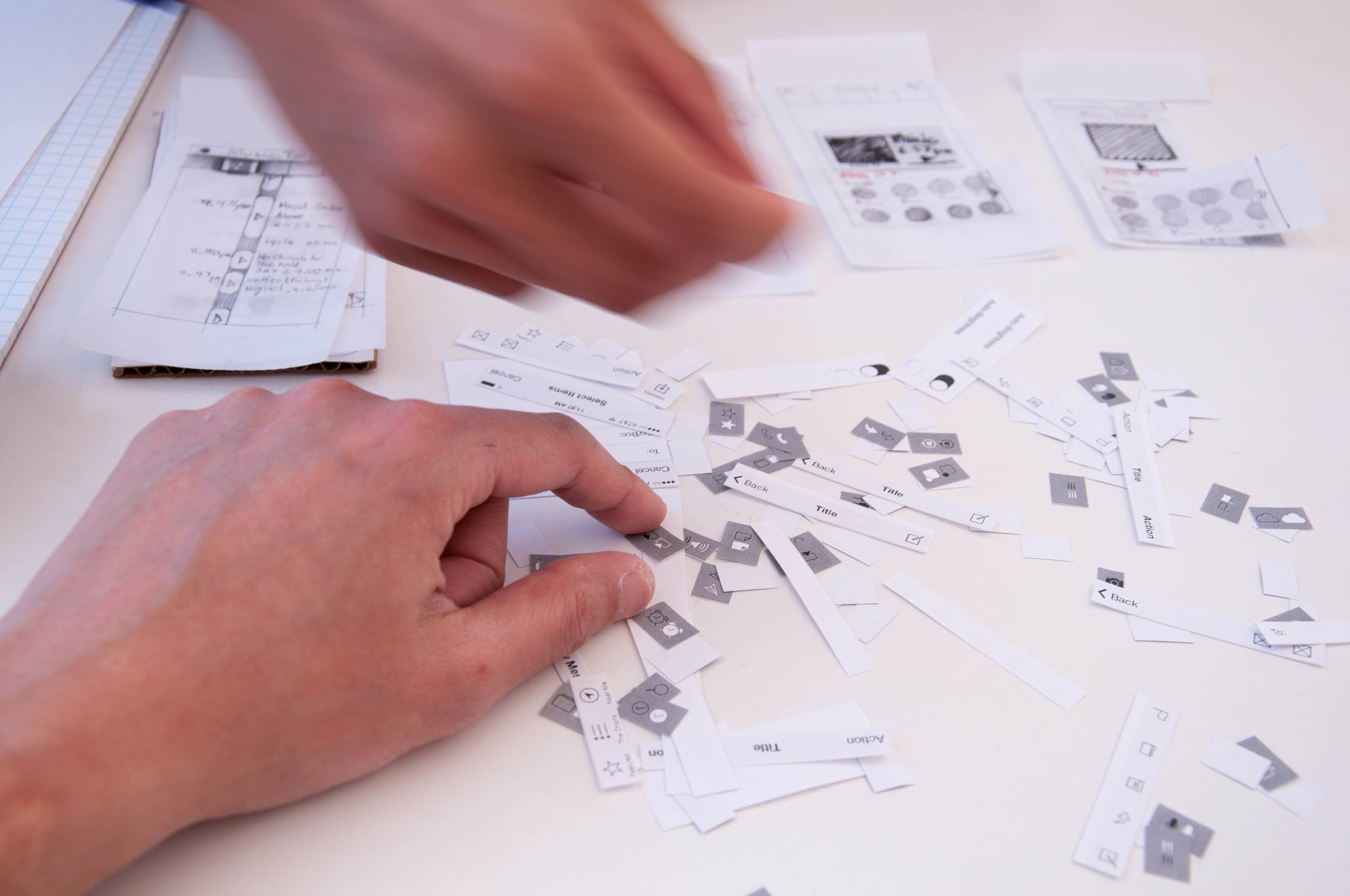
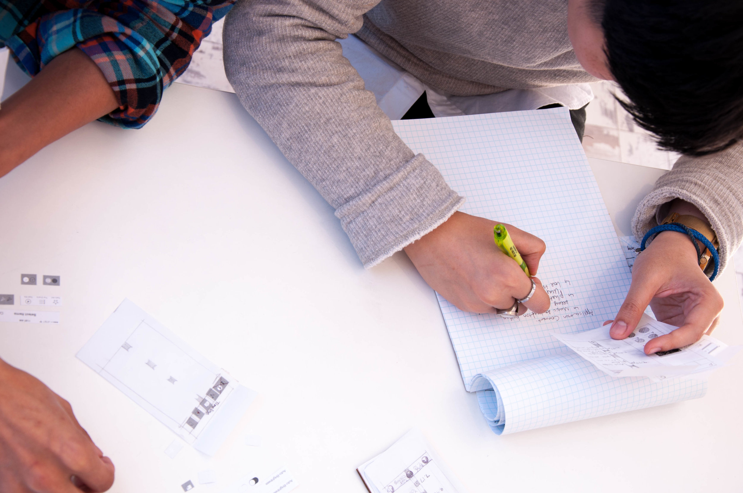
Span is an app to manage and map social media activity for users to a specific moment or an enjoyable event. The design of Span is simply white and purple, a purple band on top and white below. All of the design solutions were tested by users before I created the final design.


